Rodewald Raw Honey
Brand design
ROLE
Creative Director | Karin Schroeder
Logo + packaging design, illustration, photography, project management, print production.
STORY
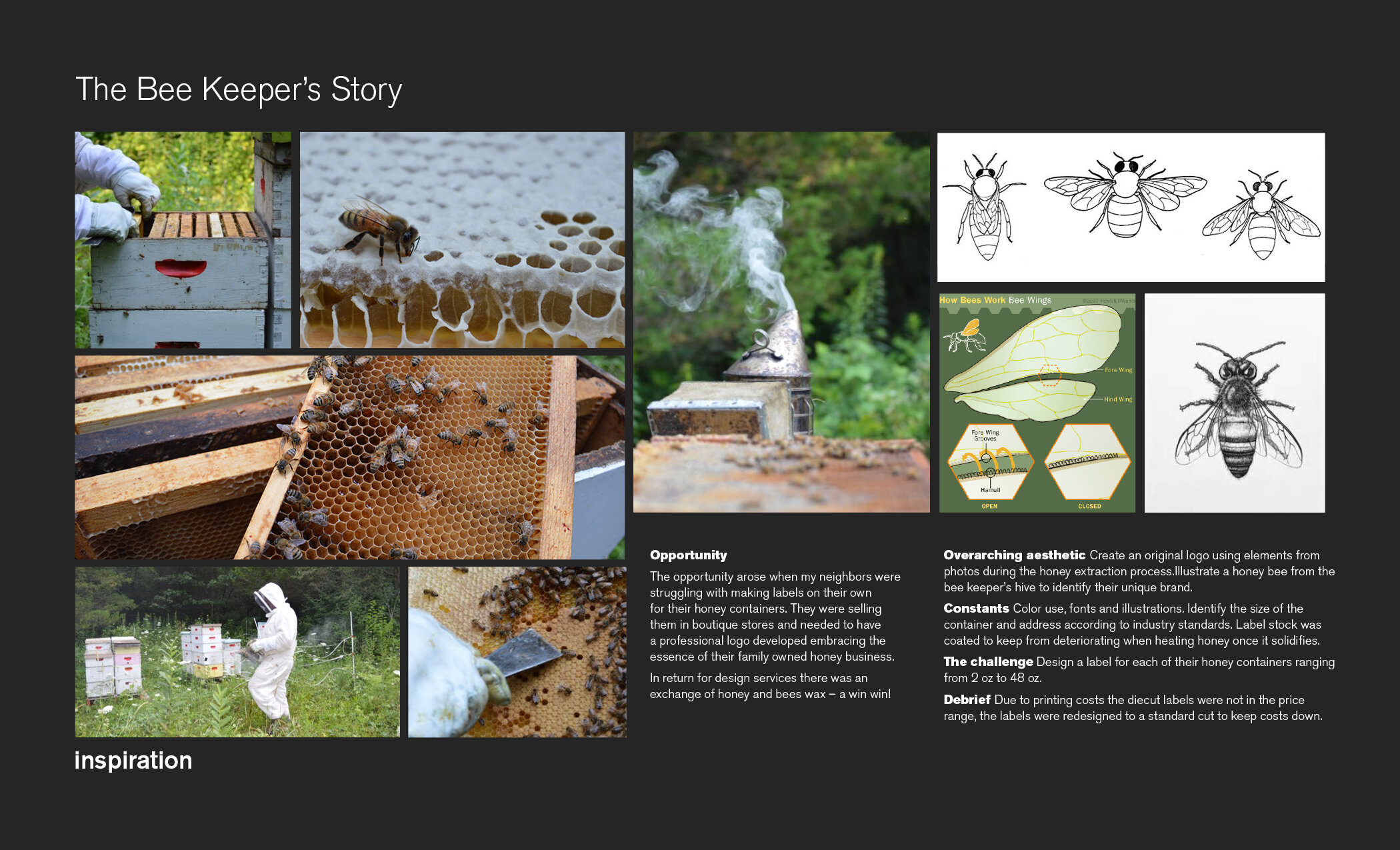
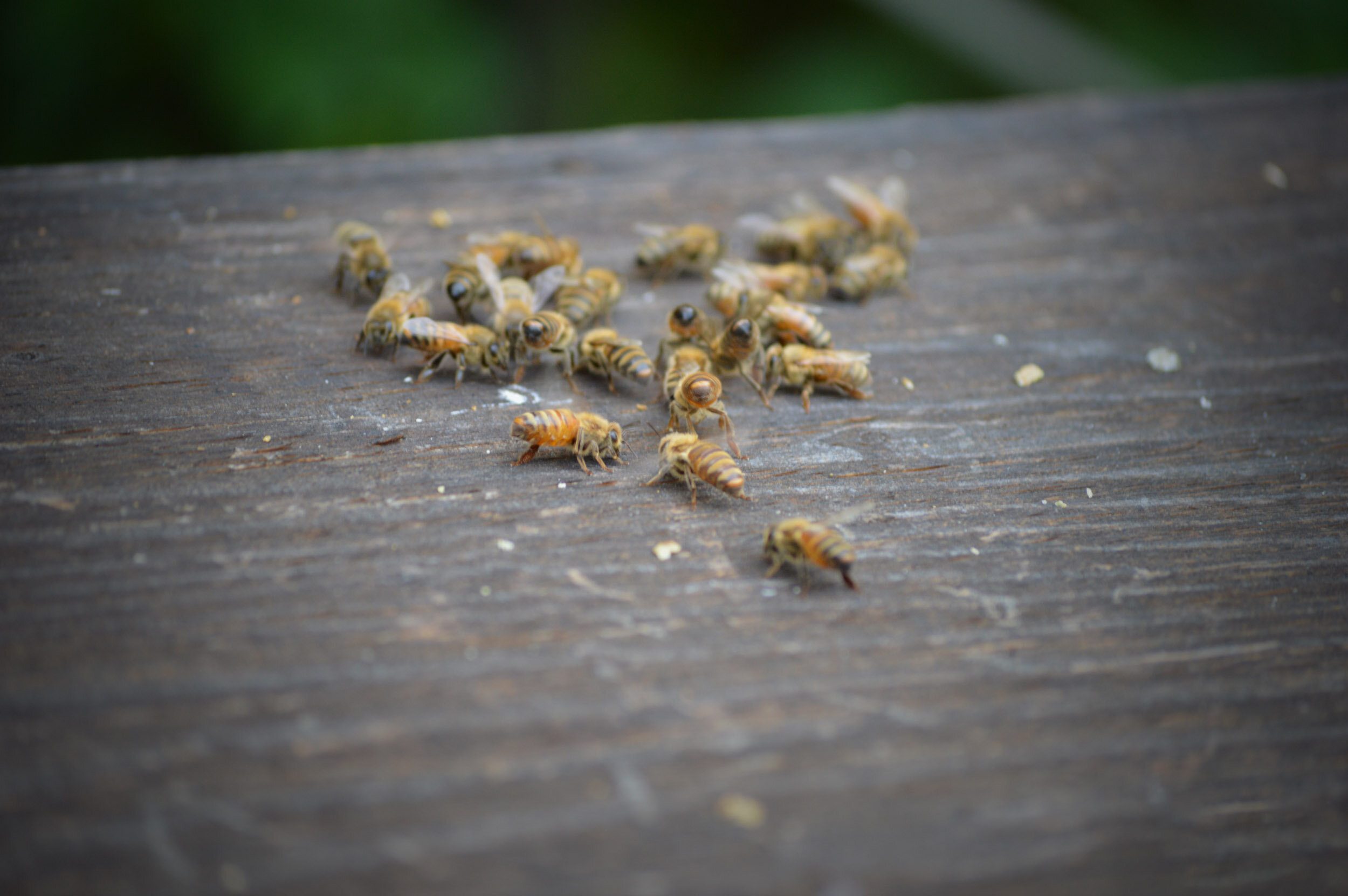
A local honey distributor was in need of a logo and product labels for their raw honey business. We started with “a day in the life of a bee keeper” where I got to learn firsthand what harvesting honey is like. Dressing in an oversized bee suit and camera in hand – I documented the dos and don’ts of bee keeping. Rule #1 Queens rule or there is no hive. Rule #2 Smoke makes bees go to the base of the hive so you can harvest the honey. Rule #3 Bears are bad, electric fences are crucial or just like Poo bear, they’ll eat all your product.
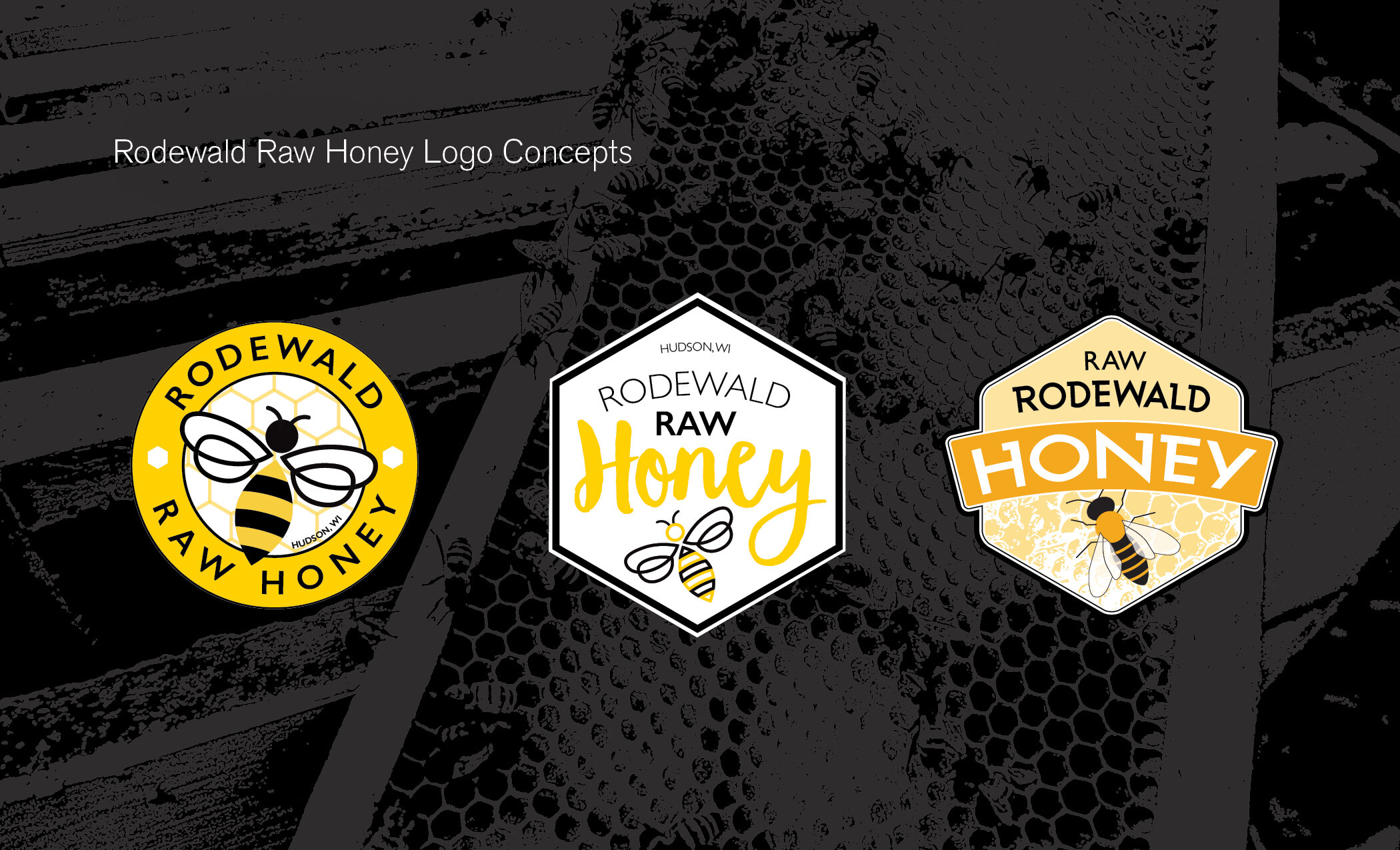
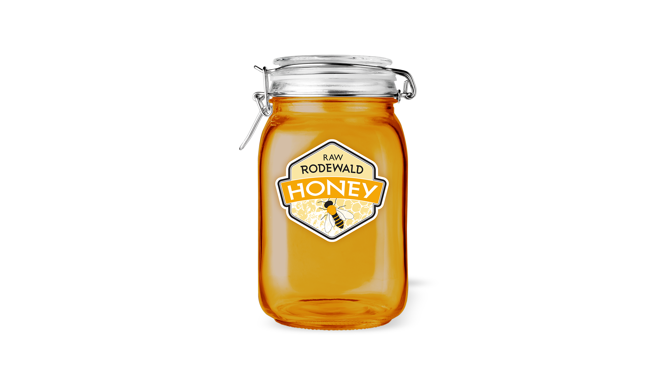
After the photos were complete – it was time to get to work. I wanted this honey bee to be a perfect representation of Rodewald’s actual bees. I studied how to draw the honey bee’s wings, face, and legs, referencing my photos to be sure I was representing the bees correctly. I did a few different styles for each logo presented, but the more realistic bee illustration was the winner. I created a vector background for the logo from one of the honeycomb photos I took – making their logo mark more personal and unique to their product.
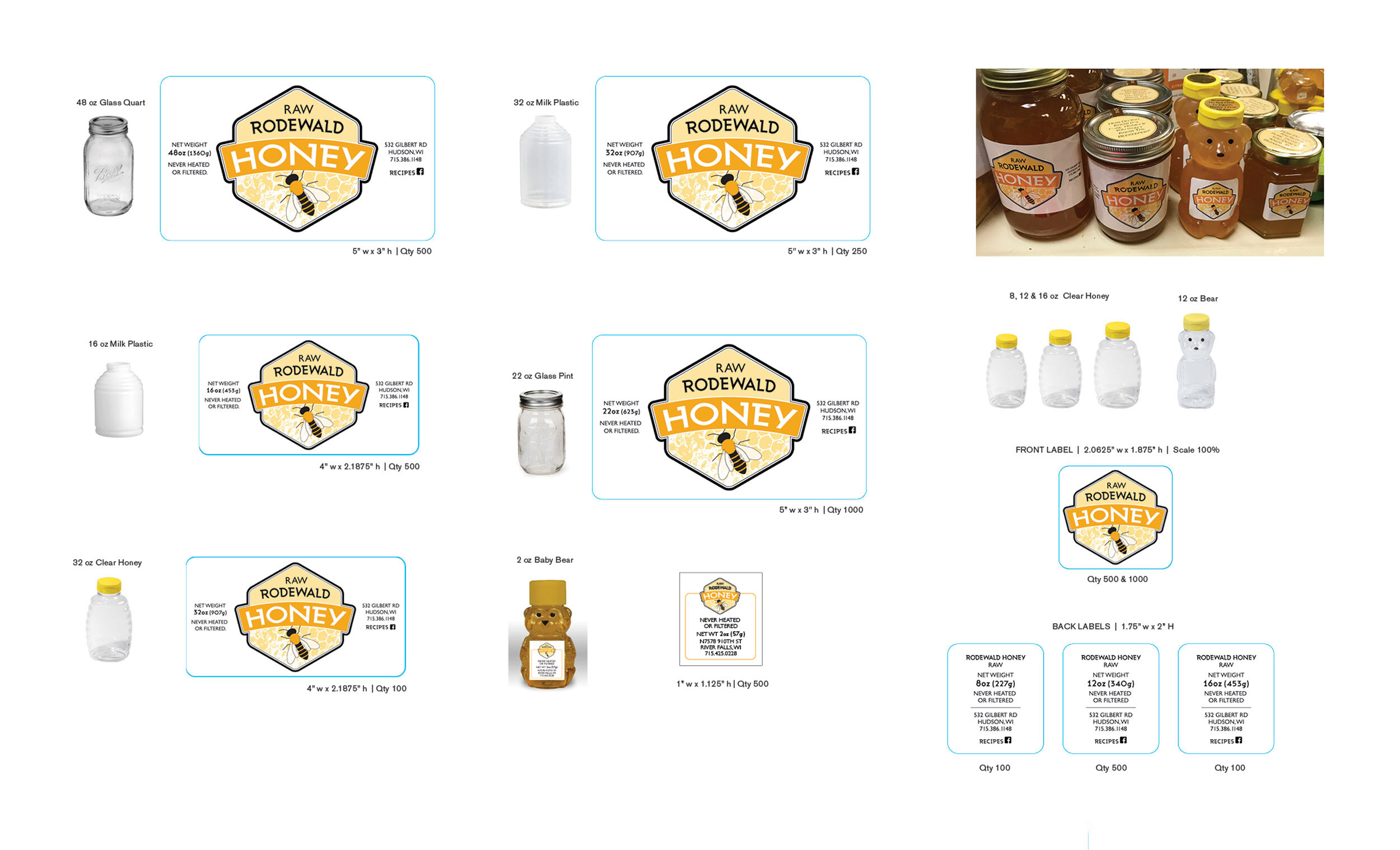
The biggest challenge was configuring the different sized containers and necessary product information for each label + affordability for printing. The bonus was trading my services for honey and getting to see the product in boutique shops in my home town.